


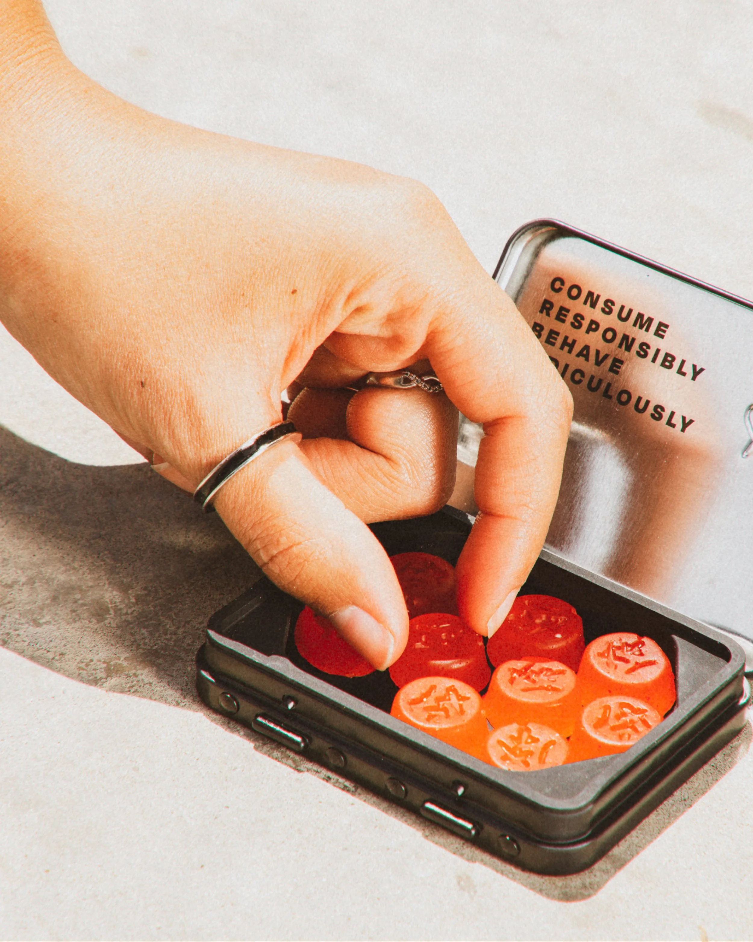


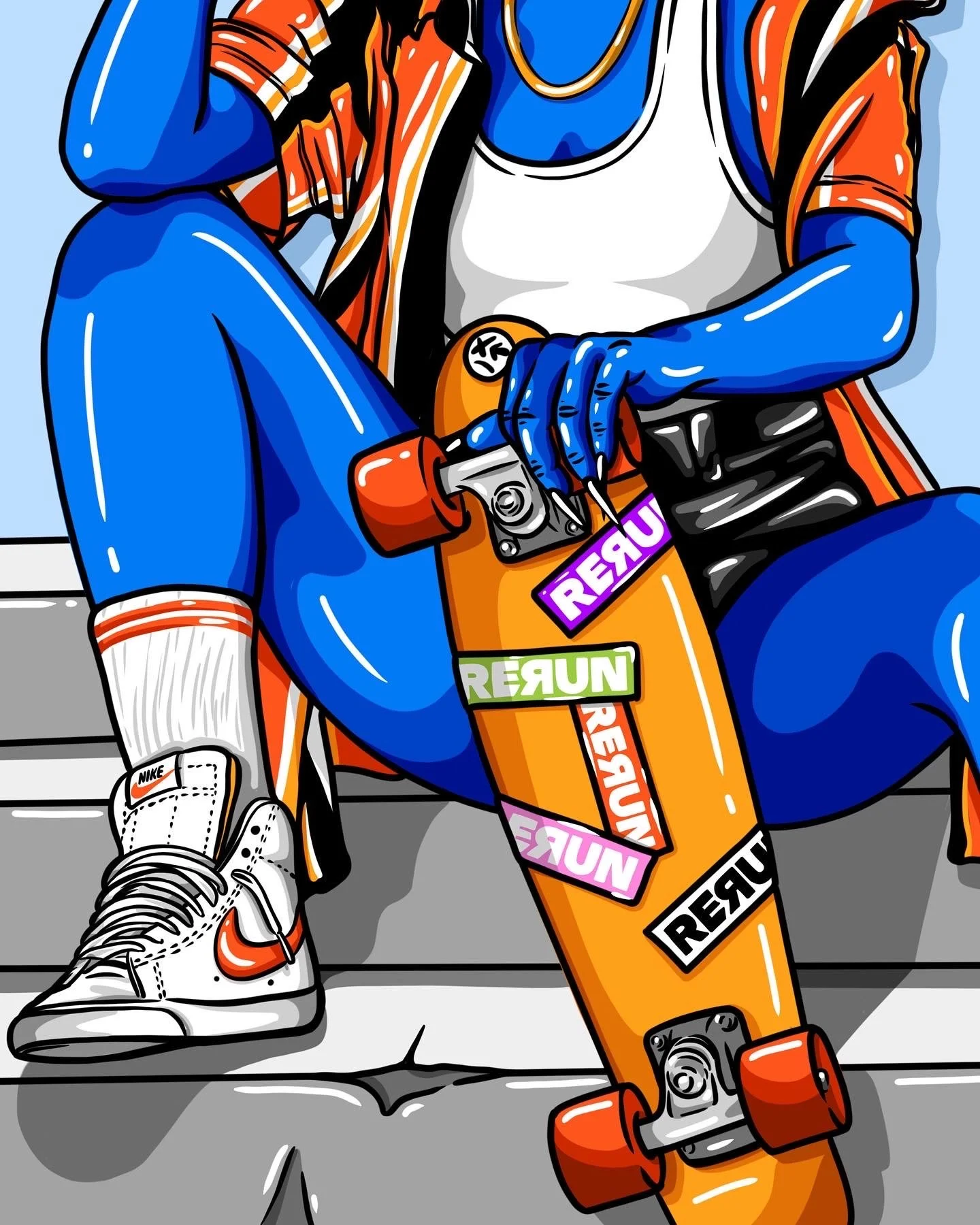


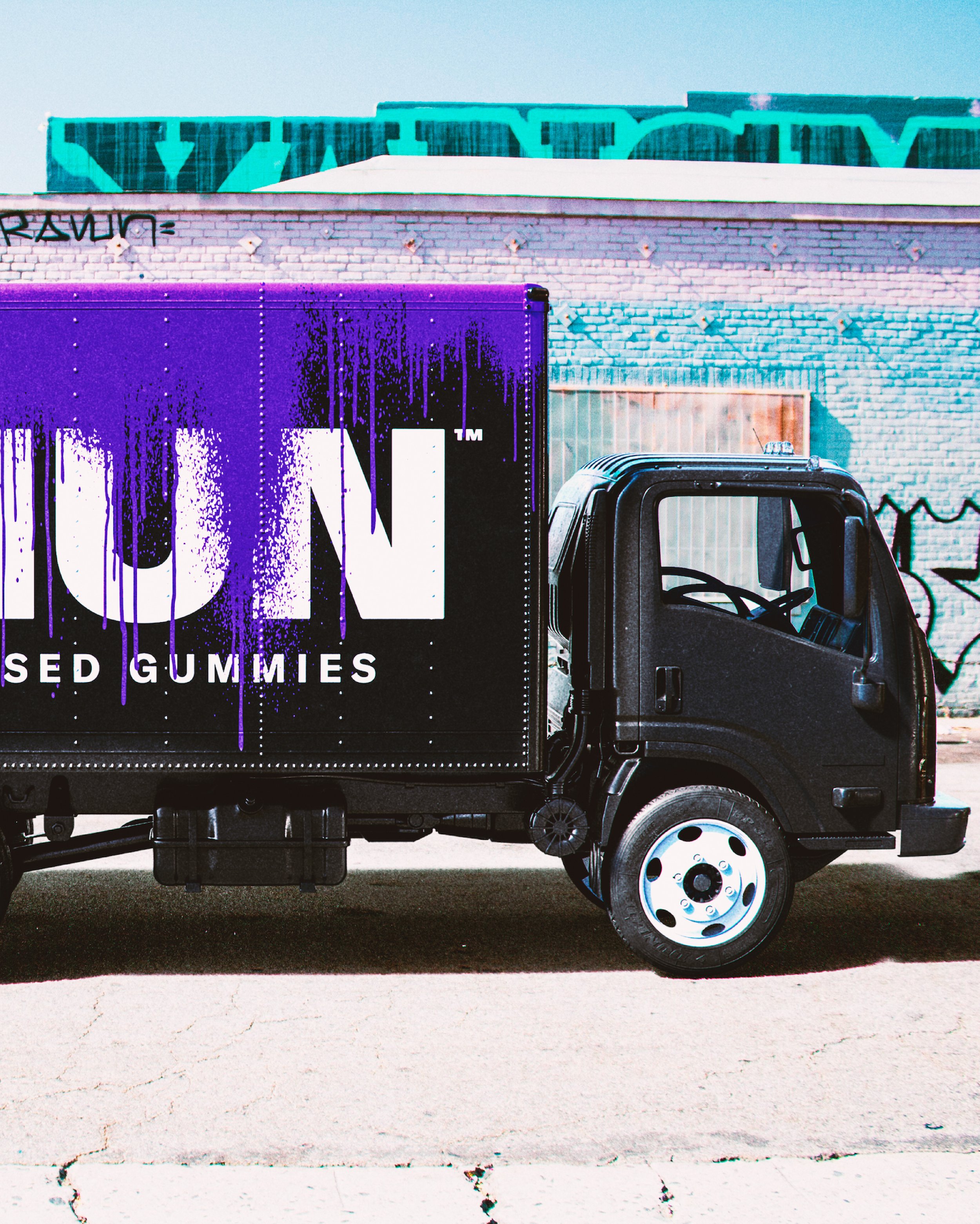
I worked with Pearlfisher to bring to life a new cannabis brand RERUN . Known for their heavy hitting dosage and bold flavors, this brand is full of grit and attitude. Inspired by wild nights out, RERUN’s name is a call to action with a “zero fucks” attitude that makes you want to relive, replay and rerun that night all over again. The logo mark has a wink of an arrow in the letter forms to nudge the night into action while the second R speaks to the nights we want to rewind & relive. The packaging has a slick outer metallic pack that heroes the brand with a fun play on words for each flavor name. The inner tin is pocketable & allows for complete digression with a black on black aesthetic. Consume Responsibly, Behave Ridiculously.